
Mapping Health Equity
What is a mapping exercise?
Content analysis, a reflective process, can be used to determine the presence of certain words, themes, or concepts within some given data (e.g. across documents or websites). To help analyse those findings, visual outputs can provide insights into patterns and trends.
As a result, visual maps can provide a useful and timely snapshot of a single organisation/sector or aid the comparison of trends and patterns between these. Such insights can be used to promote discussion and dialogue, internally or externally with relevant stakeholders.
How have we used the mapping exercise in ARC NWC?

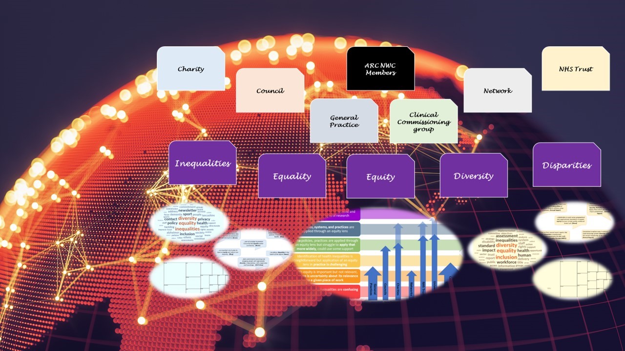
In April-May 2022, we used ‘The For Equity Thermometer’ (freely available at FOR-EQUITY forequity.uk) as a way to frame the data from a mapping exercise of ARC NWC members websites.
One of the key findings of that exercise was the lack of equity related considerations in our member organisations websites. This allowed us to then have discussions with individual members to explore if the equity lens is missing from their work or just their communications.
A visual exploration and comparison of Health Equity findings was reported at the ARCFEST in September 2022. If you missed the event you can catch up with key highlights from the workshop here: https://youtu.be/HbwO-Ahrs3M?si=2RHE3P3t2x2KnPN8)
How can you use the visual map outputs?
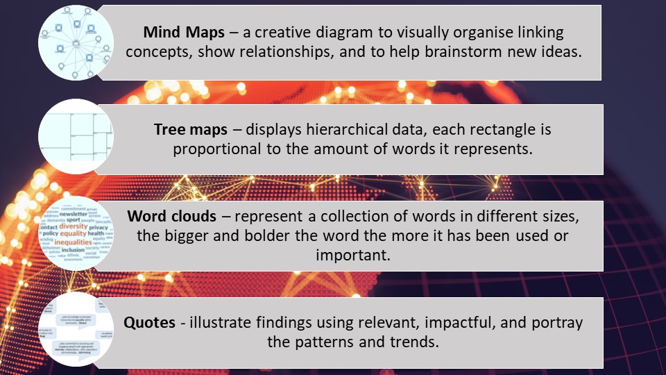
A mapping exercise is a flexible tool, that allows for higher level comparisons between sectors for example or a closer examination a single organisation’s equity journey in more detail. Visual outputs like the following examples (although this is not a full list) can help us identify patterns and trends present. Also point out to what might be missing.
What next?
The mapping exercise and the visual maps are one of the tools we employ within ARC NWC. We use it to trigger conversations and support ongoing work across the ARC NWC members towards embedding a health equity lens in their work and research. It can help us highlight where they are now in their equity journey. Identify what is needed next. And explore how the ARC NWC can support them to move things forward with the aim of conducting research that has the capacity to help reduce health inequalities and increase health equity.
If you want to find out more about the methodology or want to discuss how ARC NWC can support your own Health Equity mapping exercises, please contact k.panagaki@lancaster.ac.uk
COPYRIGHT
All materials on this site are the property of the NIHR and ARC NWC unless stated otherwise and are covered by the rules of Crown Copyright.
You are encouraged to use and re-use the information that is available on this site freely and flexibly for personal learning purposes. If referencing or reusing you should acknowledge the copyright and source of the information
You are not permitted to reuse the information contained on this platform for commercial gain.
